
UX CASE
How might we make travel booking simpler and more transparent?
2 months, 2026
Product Designer
E-commerce + AI
Planning a trip should be exciting. But for many users, the process turns into a tiring sequence of comparisons, doubts, and decisions.
Although travel platforms offer everything in one place, the sheer amount of information can make the experience tiring, confusing, and lacking transparency.
In this project, I investigated how to simplify the planning experience at Decolar, helping users organize a complete trip in a clearer and more intuitive way. At the same time, the proposal aims to generate business value by increasing conversion, encouraging the purchase of complementary services, and strengthening traveler loyalty.
What was making the experience so difficult?
The research revealed some consistent patterns. The key finding was that users didn't need more options. They needed more guidance.
Long lists made decision-making harder
AI wasn't perceived as useful
Users compared prices across multiple sites
The final price diverged from the price initially perceived
Navigation reflected the product's structure, not how people plan trips
Questioning the current state
I started by questioning the platform's current experience: did the available features actually help users plan a trip, or did they just add more steps to the decision process?
This perspective helped me understand that users struggled to compare options, understand the final price of the trip, and navigate through a large amount of information.
This indicated that the opportunity wasn't in adding new features, but in rethinking how the journey was structured. If AI wasn't delivering perceived value and existing tools weren't helping users decide with confidence, there was room to create an experience more oriented toward planning and decision-making.
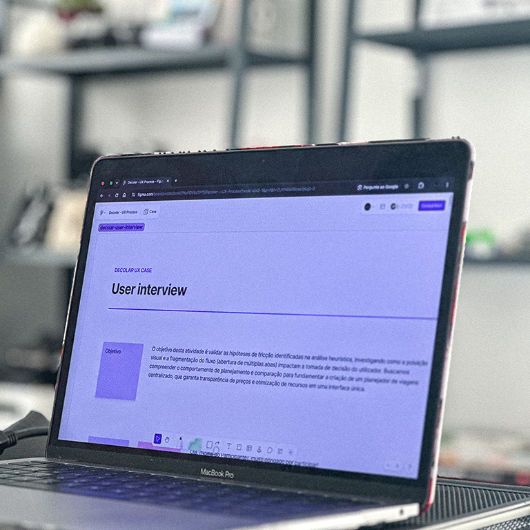
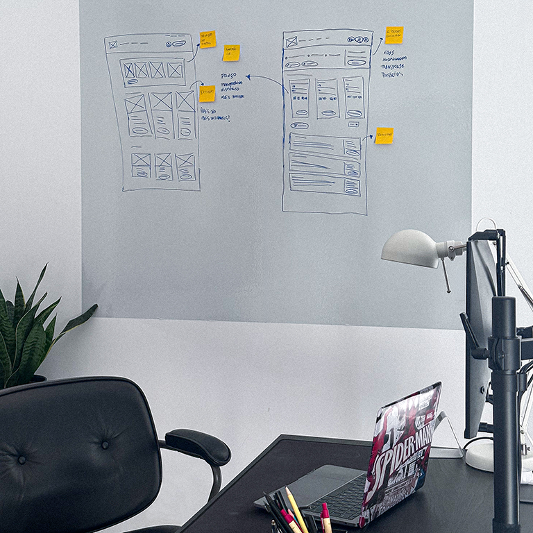
From marketplace to trip planner
The finding that users needed more guidance throughout the journey led to a shift in perspective: instead of treating the platform as a service catalog, I started exploring it as a planning tool.
The proposal was to transform an experience based on lists, filters, and comparisons into a progressive journey, capable of guiding users through the trip's most important decisions.
Instead of starting by choosing separate items or packages, the user first defines what they want to include in the trip (flight, accommodation, etc.). Based on these choices, the experience adapts automatically, showing only information relevant to that context.
The main initiatives to support decision-making and reduce cognitive load are:
Navigation oriented around the user's goals
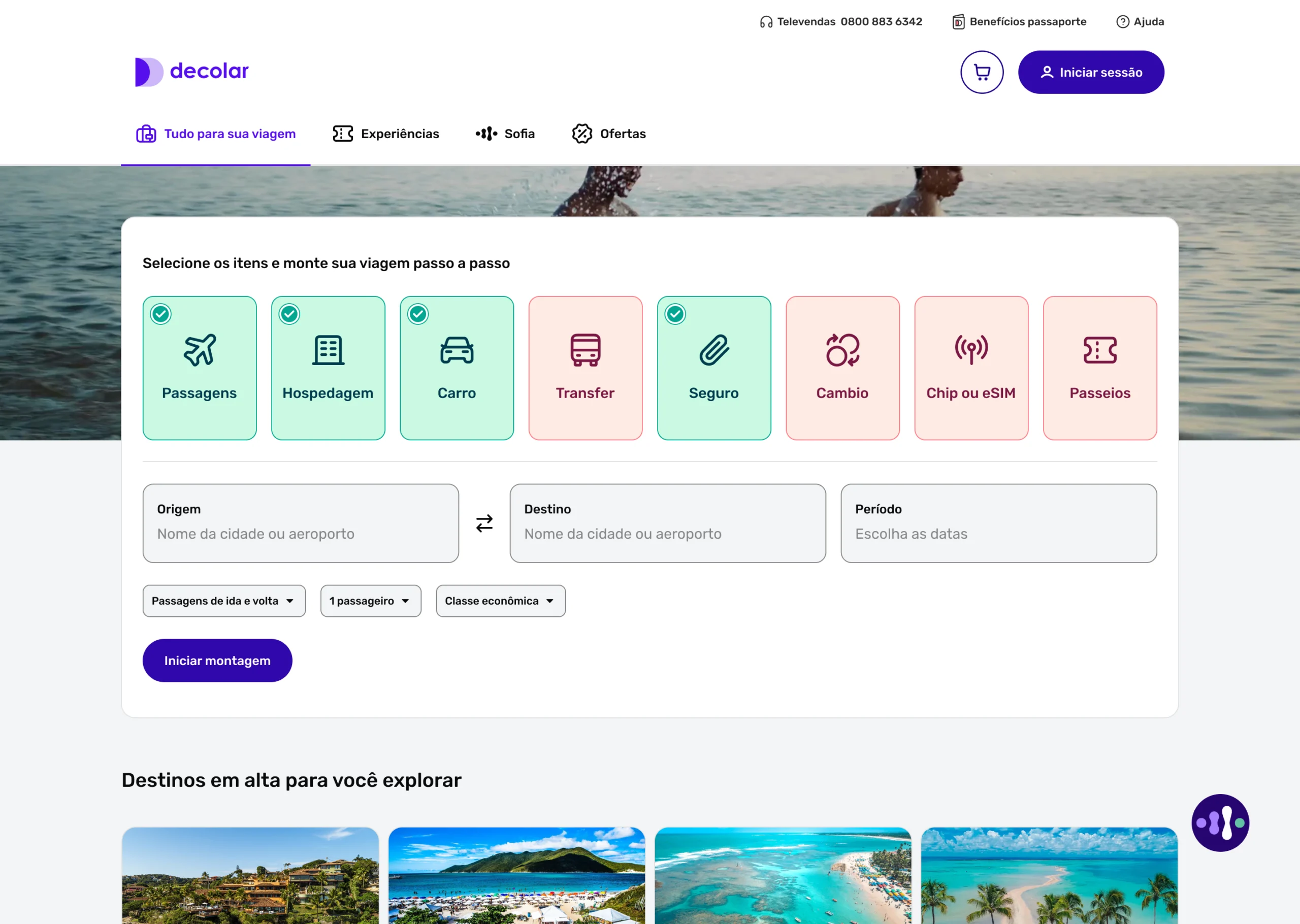
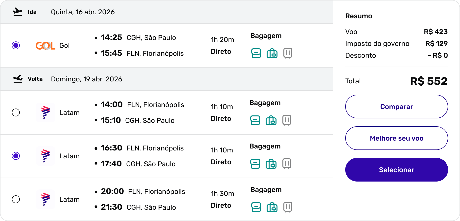
Journey divided into progressive steps
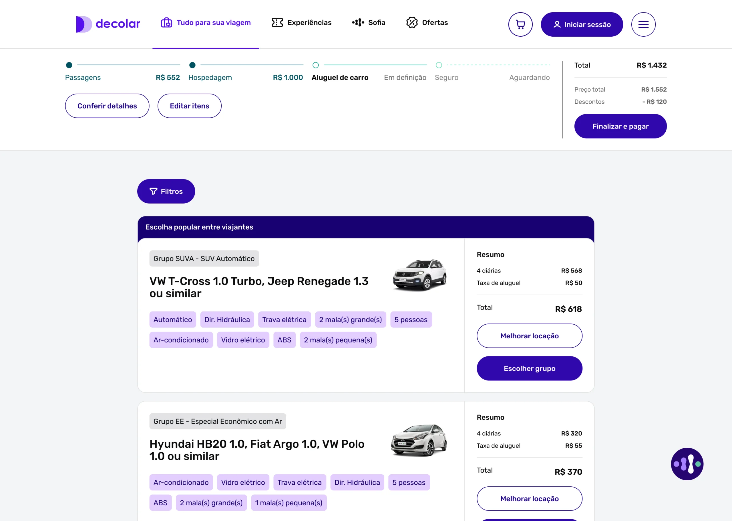
Side-by-side comparison between items
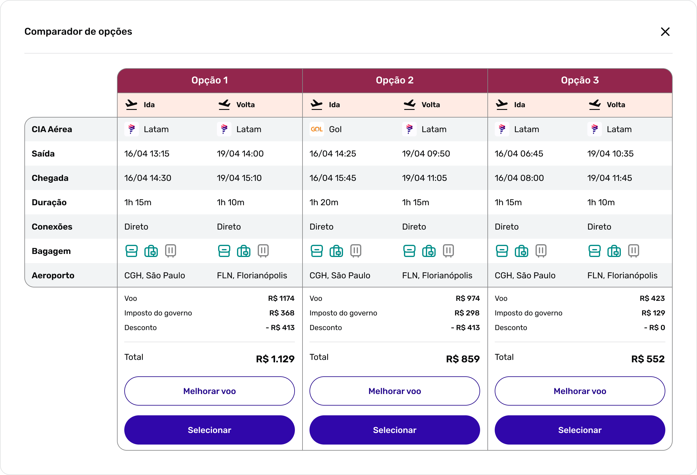
Price transparency throughout the purchase
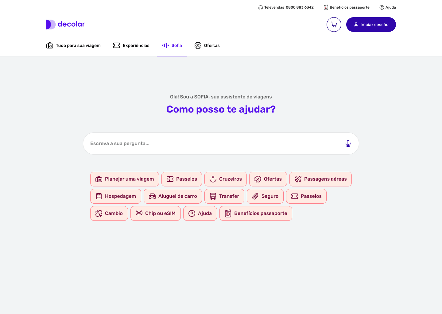
Contextual AI recommendations and proactive support throughout the journey
Expected impact
The proposal aims to:
Reduce decision overload
Increase price confidence
Decrease the need for external comparison
Improve journey conversion
In retrospect
Throughout this project, I realized that the challenge wasn't a lack of features, but how they were presented to users. When the focus shifts from selling services to helping people plan a trip, the experience stops being a sequence of isolated choices and starts working as a journey oriented toward decision-making.
More than simplifying the interface, this project explored how to turn the complexity of planning into a clearer, more transparent, and more reliable experience.